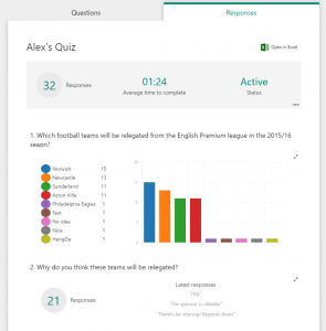
Yesterday I posted about my first experience of Office Forms and attached a form at the bottom for users to play with to answer my questions. The form had three questions which were three different types of question types available which include Choice (used multiple choice), Text and Rating and I wanted to share the results so you could see what it looked like. I spent the day watch the numbers grow and it also changes as more answers came through. So thank you to the 32 who responded even though many of you may know nothing about the English Premier League and Aston Villa.
The first question was multiple choice but I also left in an option for you to fill in your own. People filled in the normal 4 answers but there were 5 other options added. These 5 were added but not available to others to see.
The results first started as a pie chart but once we had 6 different types of answers it moved to being the bar chart.
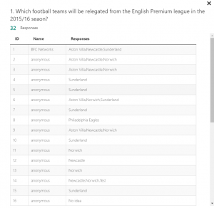
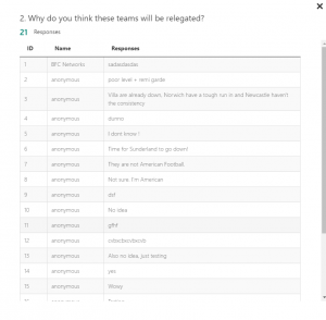
Next to each question you can see a two way arrow in the top right. When selecting this you get a table of answers. Of course lots of these are anonymous but if the user is logged in, you can see who said this from their Azure AD display name.
The second question was free text but did not have a requirement around it (where you needed to answer the question). From the 21 people who did answer, on the home page (the first image of this post) you can see the last 3 responses but again when selecting the arrows you can see all answers.
The final question was a rating (and thanks to those who rated Aston Villas season as a 2.68 our of 5 as I feel it was a lot worse than that). By selecting the arrows you can see each users response.
I mentioned yesterday that you could download a Excel spreadsheet of all the answers. I still wish there was an option which asked if you would like to send it to your OneDrive for Business but just being able to get it in Excel is great.
In here we can see each of the users responses, time and who they were (with their User Principal Name as well as their Display Name). The spreadsheet is already formatted with a table and easy to navigate. The multiple choice question has each of their answers in the single cell while the others have their answers as well.
The spreadsheet is a lot better to see who answered what across the form. When selecting the arrows in the browser you can’t easily navigate to see what the user gave across all their answer so this spreadsheet does help with that. Just to take this data and add it to PowerBI now.


I’ve just started playing with forms and it looks great. A couple of question types missing but otherwise very good. So much potential.
What questions types would you like to see Gareth?